Picture Books 101 Behind-The-Scenes: Creation Of A Picture Book Cover
Also a reminder to writers about why they should CREDIT ILLUSTRATORS
Welcome to my Picture Books 101 post series, in which I talk about the basics of writing and illustrating picture books for young readers.
You’re probably familiar with the saying, “Never judge a book by its cover.”
While there is wisdom behind this advice, the truth is that people DO often judge a book by its cover. A book’s cover gives us an idea of what we can expect to find inside, including the genre and mood. In children’s books especially, a cover can encourage (or discourage) a young reader to want to pick it up to read or have someone read to them.
No wonder publishers put so much thought and time into the design and content of a book cover and jacket.
To WRITERS out there: When you do a cover reveal, PLEASE credit the illustrator. Also credit the book designer, if the illustrator didn’t also do the design. When you post about a book you wrote that has any kind of illustration, PLEASE credit the illustrator. For more reasons why, please visit the #PicturesMeanBusiness website: How Writers Can Get Involved.
Many assume that the illustrator of a picture book is also responsible for the entire cover design. Sometimes this is true. In my books, however, I would much rather have someone with experience to design the cover.
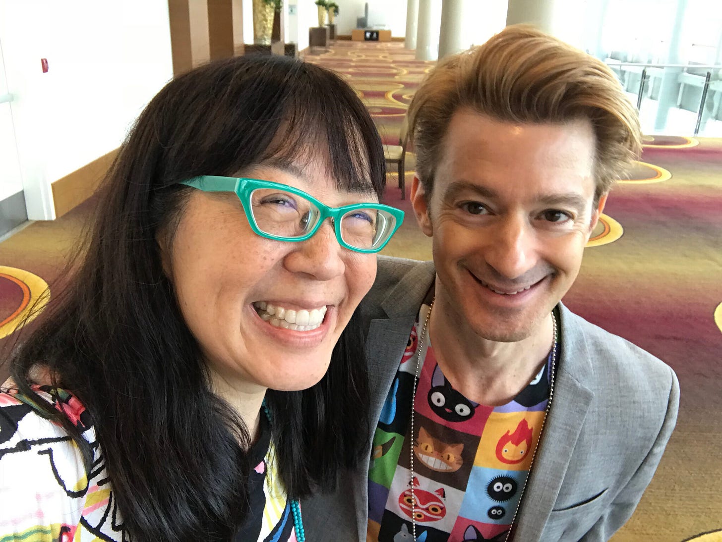
For my solo picture book, I WANT TO READ ALL THE BOOKS, I rely on the brilliant design sense of my Simon & Schuster art director, Laurent Linn.
Above: Me, with Laurent Linn.
I have worked on many Simon & Schuster picture book covers with Laurent. Different illustrators and art directors may have their own process, but ours usually goes like this:
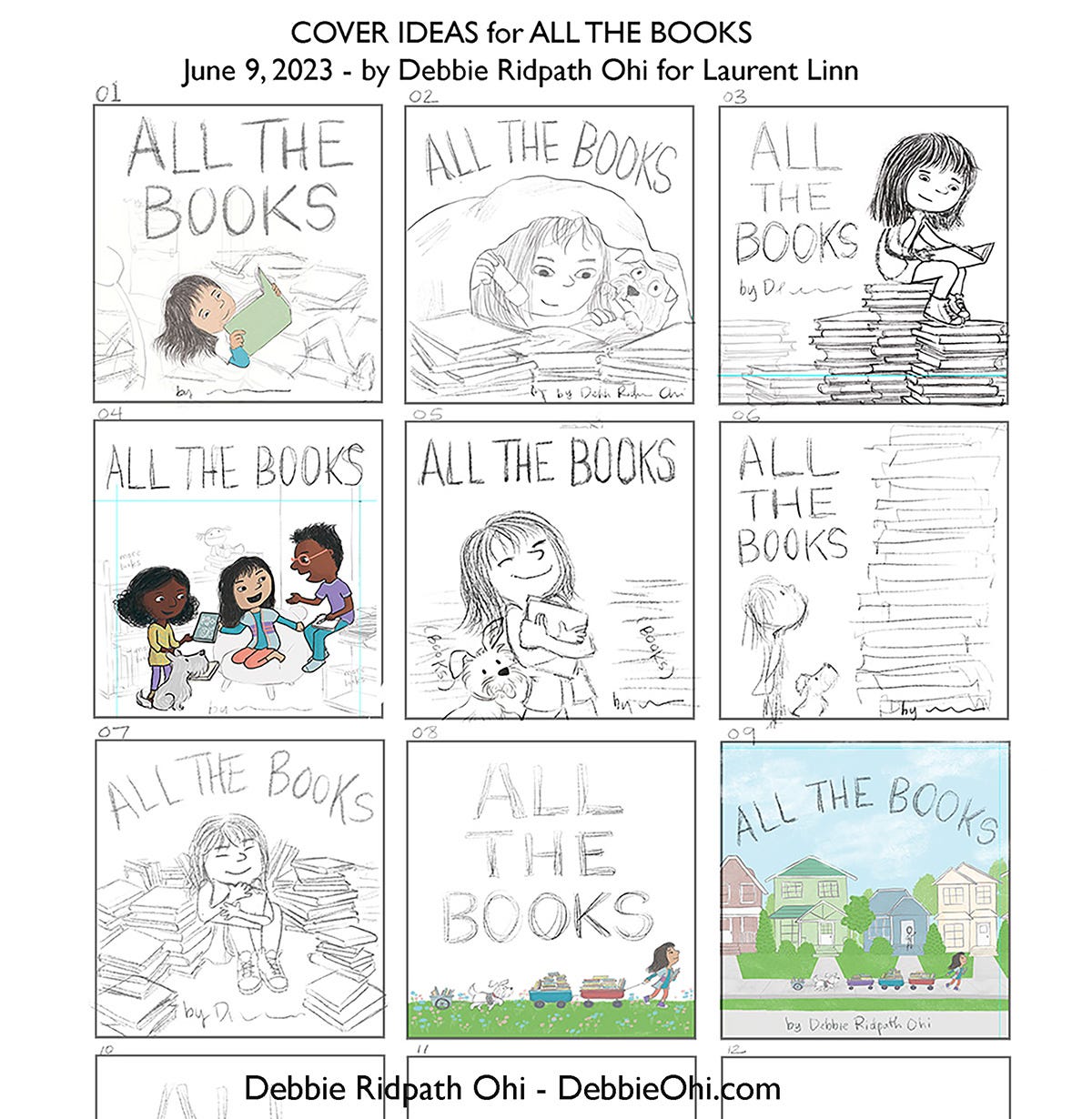
While I’m still working on the interior illustrations for a picture book, usually during the final art stages, Laurent will ask me to start thinking about cover ideas. Here are some of the ideas I sent in my first batch for the cover of I WANT TO READ ALL THE BOOKS:
Note that at this point, the title of my book was ALL THE BOOKS. My editor suggested we change it to I WANT TO READ ALL THE BOOKS because it better conveyed what the story was about. I agreed! I am terrible at coming up with book titles. An aside: My original story title for WHERE ARE MY BOOKS? was SPENCER AND THE BOOK THIEF. Justin’s title suggestion was much better!
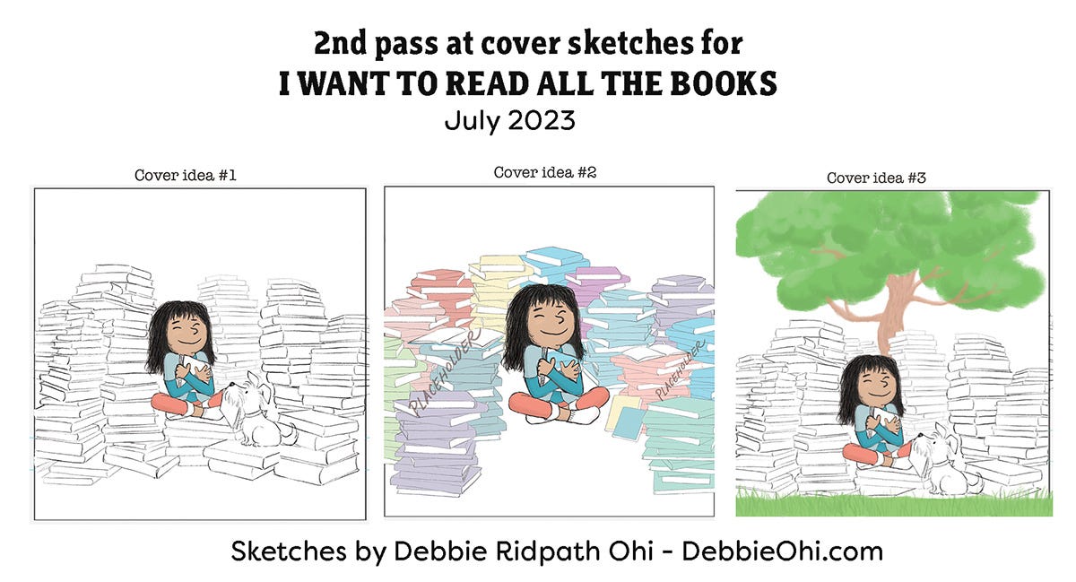
Feedback from this first batch: Justin and Laurent liked Image 07 the best, where the little girl is hugging a book, surrounded by piles of books. I was also asked to add MORE books. Here are some of the cover sketches I sent in for my second pass:
When I sent this batch in, I let Laurent know that the piles of books were just a placeholder until we had settled on a layout design. The books were incredibly time-consuming to draw, I found, so I didn’t want to invest too much time on those details yet.
They liked elements of both Cover Idea #1 and #2, but to add MANY MORE books and leave room at the bottom in the middle for my byline. Also, as I started finetuning the book details, I was reminded to make sure the dimensions of the books were appropriate for picture book readers (generally thinner than books for grown-ups).
At this point, I knew I needed to start using reference images. I started to take photos of picture books piled up in my studio but quickly realized this was impractical, given the small size of my workspace.
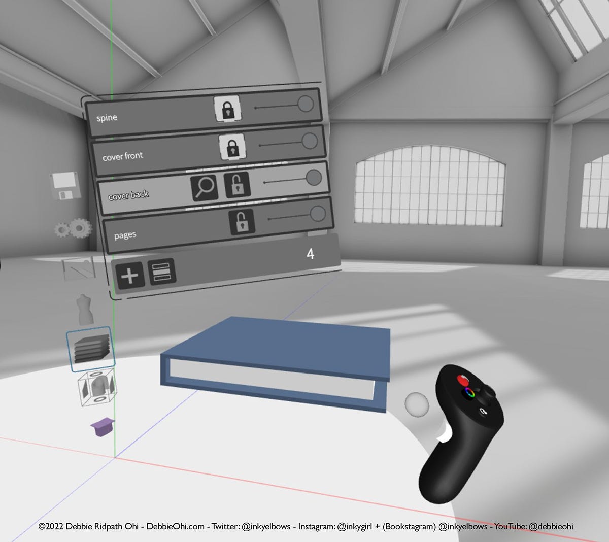
I had already experimented with 3D modelling and VR art for reference images in I’M SORRY, so used various 3D modelling apps like Gravity Sketch, Blender, and Adobe’s Substance 3D Modeler and Stager to create models of books and piles of books.
This enabled me to play around with different camera angles, and I took screenshots of the ones I liked. I could then collage them into the rough reference shots I needed….not just for the cover, but for interior illustrations as well.
These collaged reference images helped guide me as I drew the book piles I needed, in my own illustration style. Note: I could have used perspective line drawings to do this as well! I have no formal art training, however, and I’m also lazy. 😜 My method isn’t for everyone, but it makes it more fun and feel more organic in my own creative process.
Above: Using Gravity Sketch to create a 3D model of a book in VR.
I also created environment scenes for some of my interior illustrations! Here’s one I created for a kitchen scene:
I used Adobe Substance 3D Stager for the above. It’s pricey, but I was already using some of the other apps in the 3D/VR suite at the time. I also found the access to Substance 3D Assets super-handy, so I didn’t have to create every physical element from scratch. I made sure to just use my screenshots as a rough reference and redrew using my own illustration style, changing details, to avoid having the final illustration look too technical.
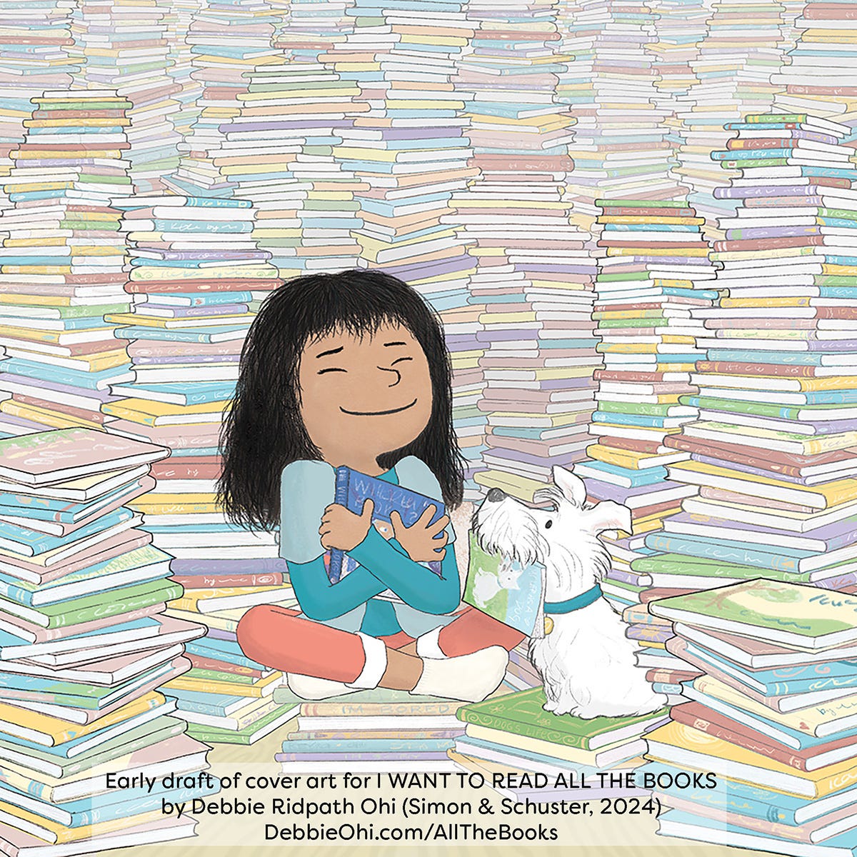
Anyway, here’s the next iteration of the cover art that I sent to Laurent:
Laurent Linn asked me to add more depth to the towers of books to make the scene look less flat. I sent an attempt to do this, but wasn’t happy with it and asked Laurent for advice. His useful suggestion: “Perhaps, for shadows, instead of black/gray shading, you could use a rich purple/blue which will feel less oppressive and yet will still add some shading for depth.” Laurent also said adding a bit more saturation to the books closer to us might add depth as well.
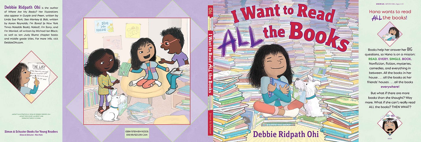
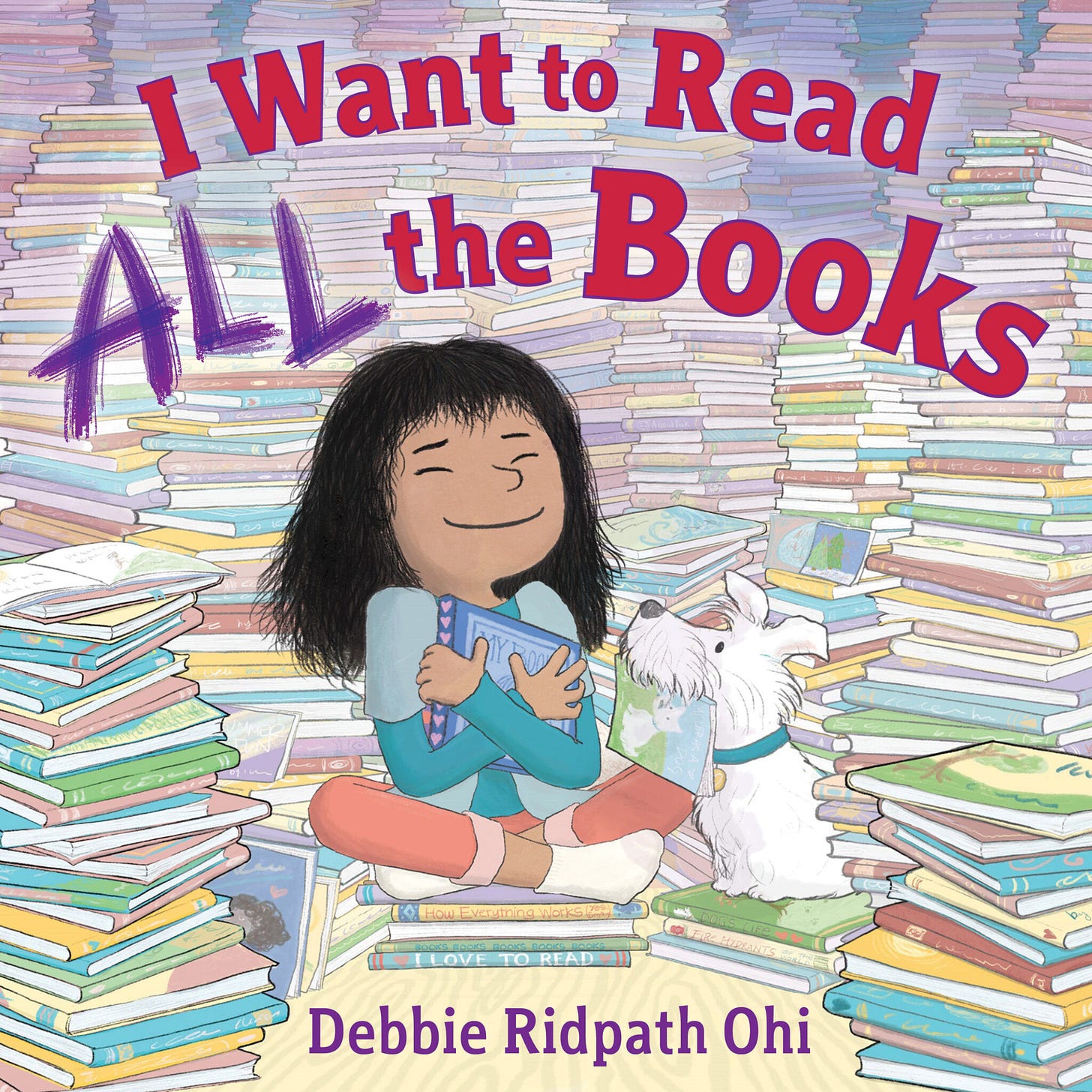
One of the reasons I love working with an art director like Laurent is because I find it incredibly difficult to be objective about my art, especially if I’m spending many, many hours on a piece. After one or two exchanges like the above, we came up with the final cover together:
So happy with how this came out! The handwritten “ALL” was created by Laurent.
As you can see, book covers can take a LOT of time and work.
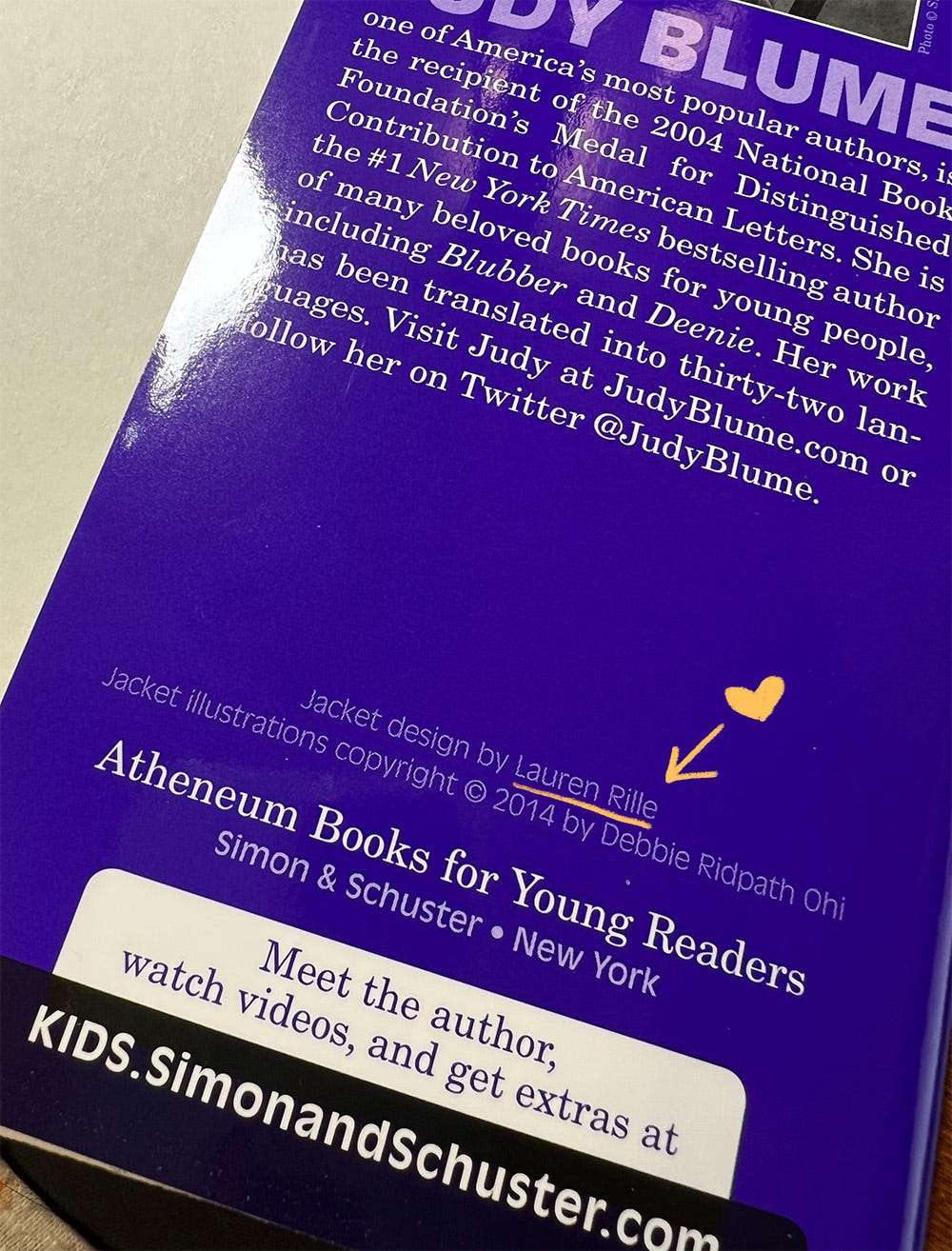
And that’s why it drives me a wee bit crazy when I see writers post cover reveals of illustrated books (or covers that include illustrative elements) without crediting the illustrator. Also DO take the time to look up the cover designer; you can usually find the info on the inside jacket flap. Here’s an example from one of the Judy Blume reissues from Atheneum/Simon & Schuster that I illustrated:
If you’d like to find out what I learned from illustrating Judy Blume’s covers, see my Substack post on the topic.
If you’re curious about more “behind-the-scenes” peeks, feel free to browse my How The Book Was Created resource. Some of these are geared specifically toward younger readers, but older creators might still find them interesting.
Meanwhile, you can find out more about my new solo picture book, I WANT TO READ *ALL* THE BOOKS, on my website! I’ve already posted about how I came up with the idea and wrote the text manuscript, and will be adding a section on how I created the illustrations next.
Do you have suggestions for what you’d like to see in a future Picture Books 101 post? Please let me know in the comments!
I had a fabulous time at the SCBWI Winter Conference in NYC last weekend! I’ve been posting some mini-albums of my photos on Instagram, and hope to post a more detailed report on Substack at some point, mainly about the pros and cons of attending in-person children’s book creator events (plus networking tips for introverts).
I was also honoured to host the #PBRisingStars Mentors Announcement on my blog yesterday, a guest post by organizers Kailei Pew and Ebony Lynn Mudd. This 3-month picture book mentorship program pairs authors, illustrators and author-illustrators with experienced mentors for one-on-one development. What an amazing opportunity.
And finally, if you pre-order I WANT TO READ *ALL* THE BOOKS by the end of August, I’ll send you a gift! Details here.
Stay warm, everyone!




So interesting! Thanks for sharing the process, especially for the word people like me.
Love the sneak peak into your process. Looks awesome. That advice from Laurent for adding the purple was ace. He’s pretty awesome. 👏